Show me the information
Since I'm in an unhinged rant frame of mind I wanted to also rant about this tendency for 'minimalist' thinking in UX/UI. I'm going to blame Google and their Material UI for this, they should be blamed for most things, but the trend has become something of an accepted wisdom amongst UI designers.
The idea is you keep the UI nice and 'clean' and only show the user the fields you believe are relevant to them. For example you truncate a message because it would wrap and break the UI scaling. Or you show just the date part of a timestamp, or even worse show "a few hours ago" instead of the actual date. Maybe you show the full time on a mouse-over event, but how do I copy that?
Hiding information to make your site visually appealing breaks real-world tasks. You can't predict what the user is going to do, you are not an oracle, so just show them the information. Even if they decide to put the entire text of the Iliad in a description field. It'll look garbage but at least they can complete their task.
There is a lack of empathy for the user in these choices. What is your user trying to achieve? How can you make that task as easy as possible? What about users who fall outside the flows you predicted they would need?
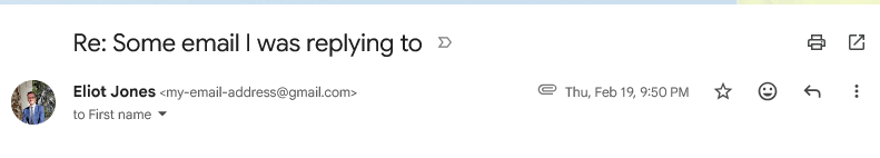
First up there's this screenshot from the fundamentally cursed Gmail UI: